Website redesign for online flowershop (as a UX designer)
Dallas Flower Florist
Website redesign for online flowershop (as a UX designer)
Dallas Flower Florist
About Dallas flower florist
Dallas Flower Florist is an online flower shop based in Texas, delivering fresh floral arrangements across the USA, Canada, and Mexico through a reliable network of local partners.
Dallas Flower Florist is an online flower shop based in Texas, delivering fresh floral arrangements across the USA, Canada, and Mexico through a reliable network of local partners.
As a student at UX land, I was assigned to redesign an e-commerce website for shopping flower:
Business needs:
Redesign the desktop version of the website with a clear, streamlined process, focusing primarily on information architecture to help users quickly and easily find their desired flowers.
Improve Visual Hierarchy : Use consistent fonts, colours, and clear product categorisation.
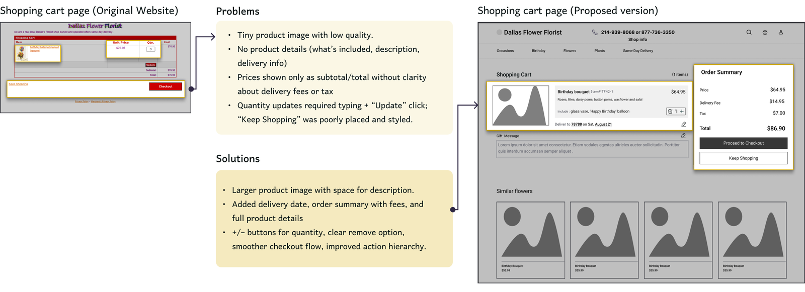
Optimise Usability : Implement quantity adjustment buttons, easy item removal, and a “Keep Shopping” option.
THE PROCESS
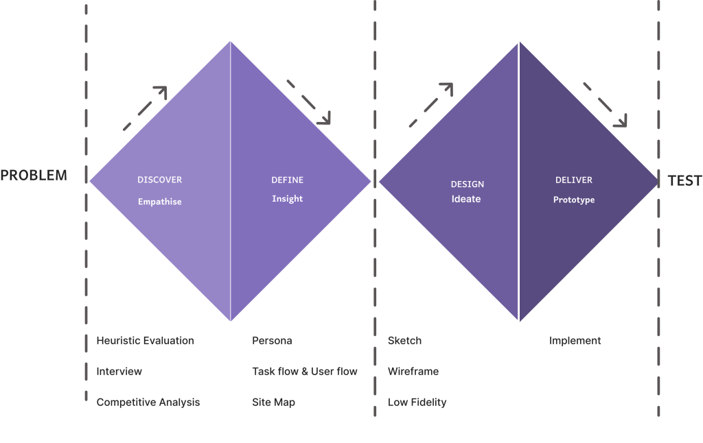
Our team followed the Double Diamond process, beginning with user research to discover key needs, then defining the problem. We moved into ideation and prototyping to develop creative solutions, and finally delivered refined designs through iterative testing and feedback.
DISCOVER
Heuristic Evaluation
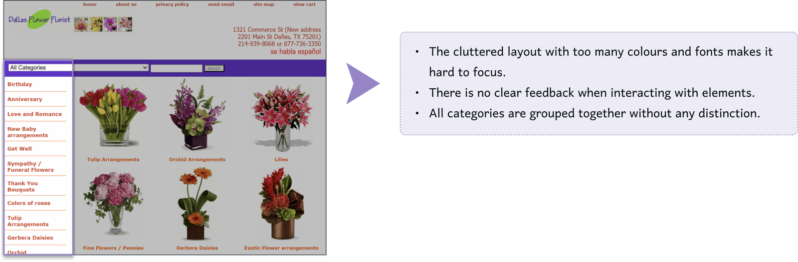
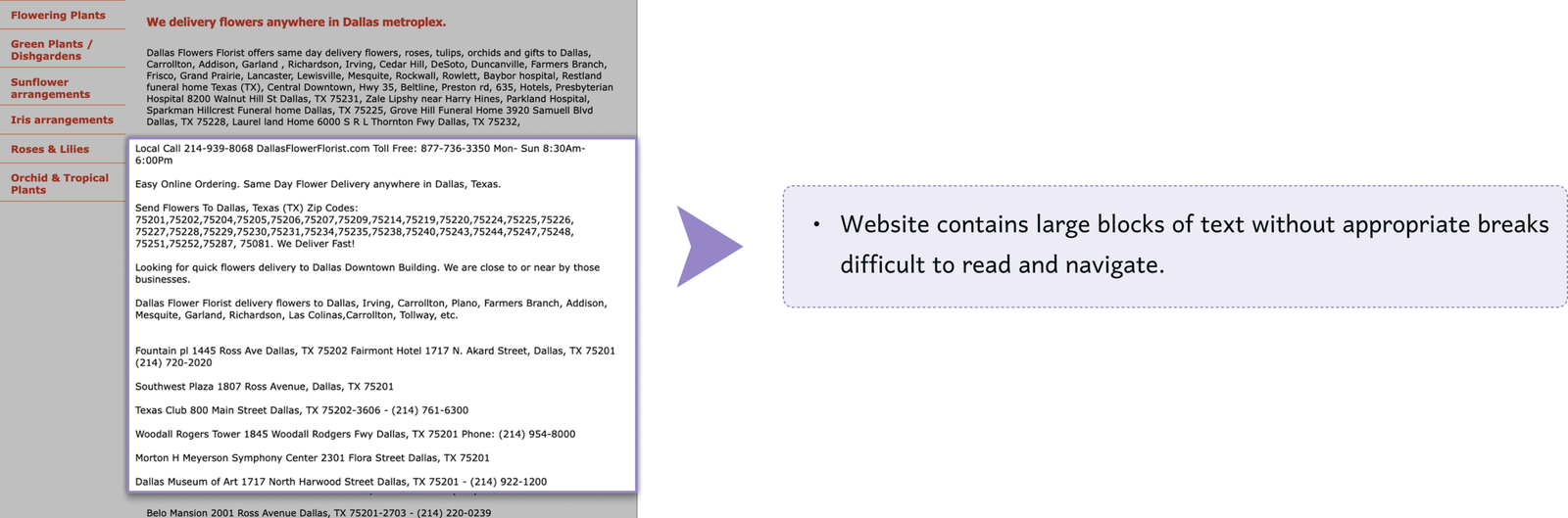
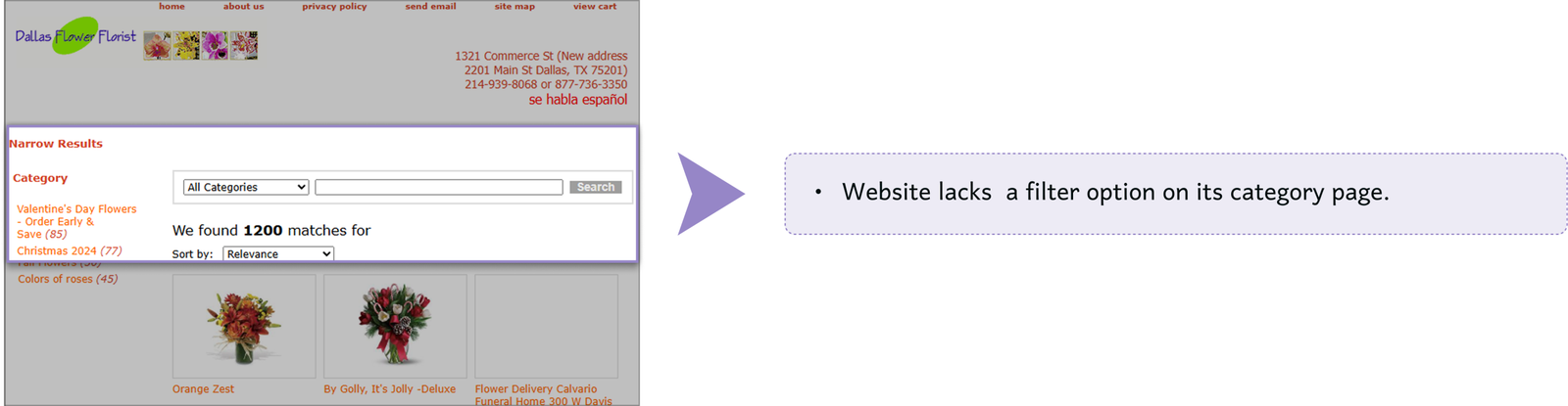
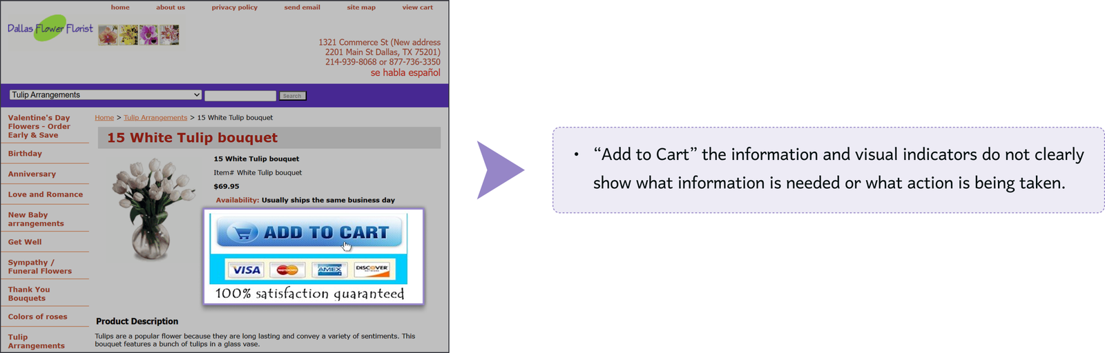
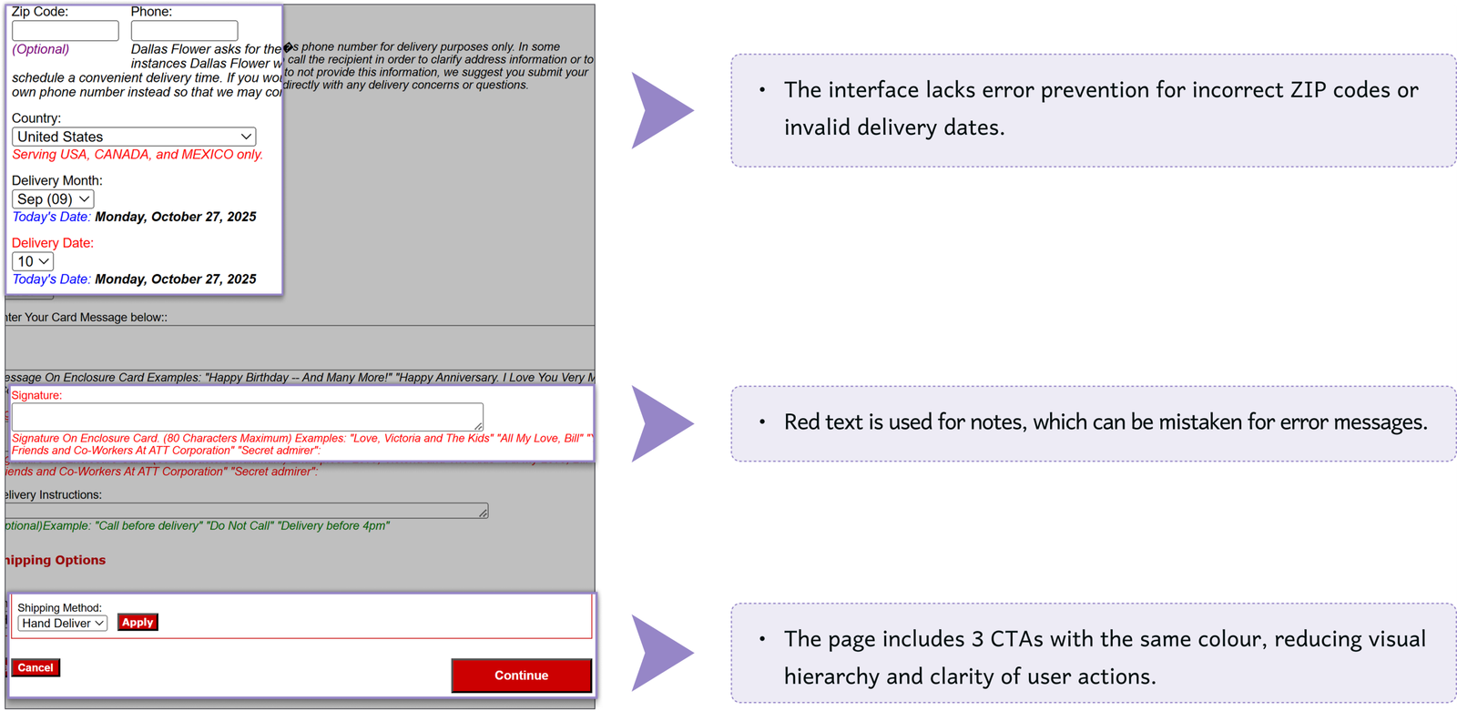
After a thorough examination of the website and a comprehensive heuristic evaluation, we identified key usability issues that contributed to a confusing user journey. These included missing or unclear elements that hindered navigation and overall user experience, highlighting areas that needed improvement.
Home page
Home page
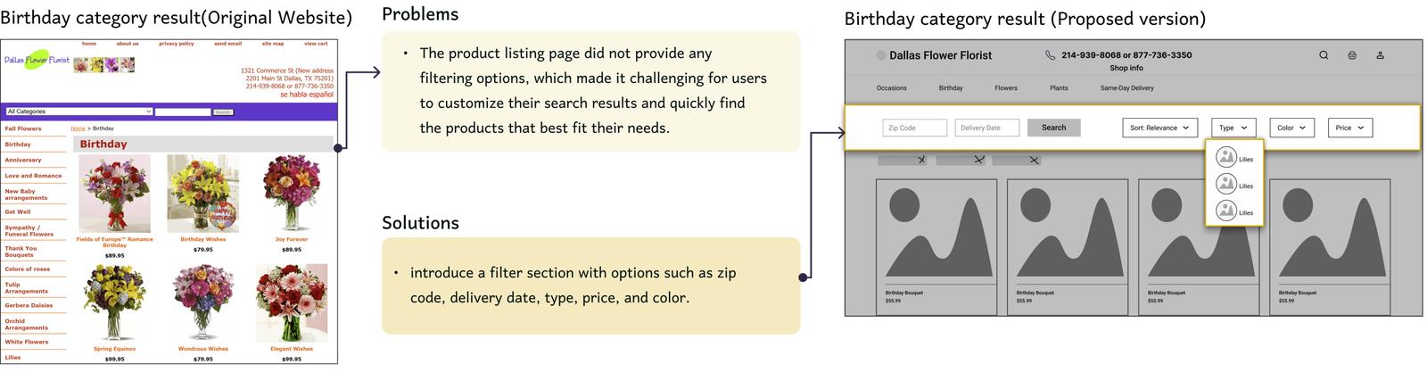
Category page
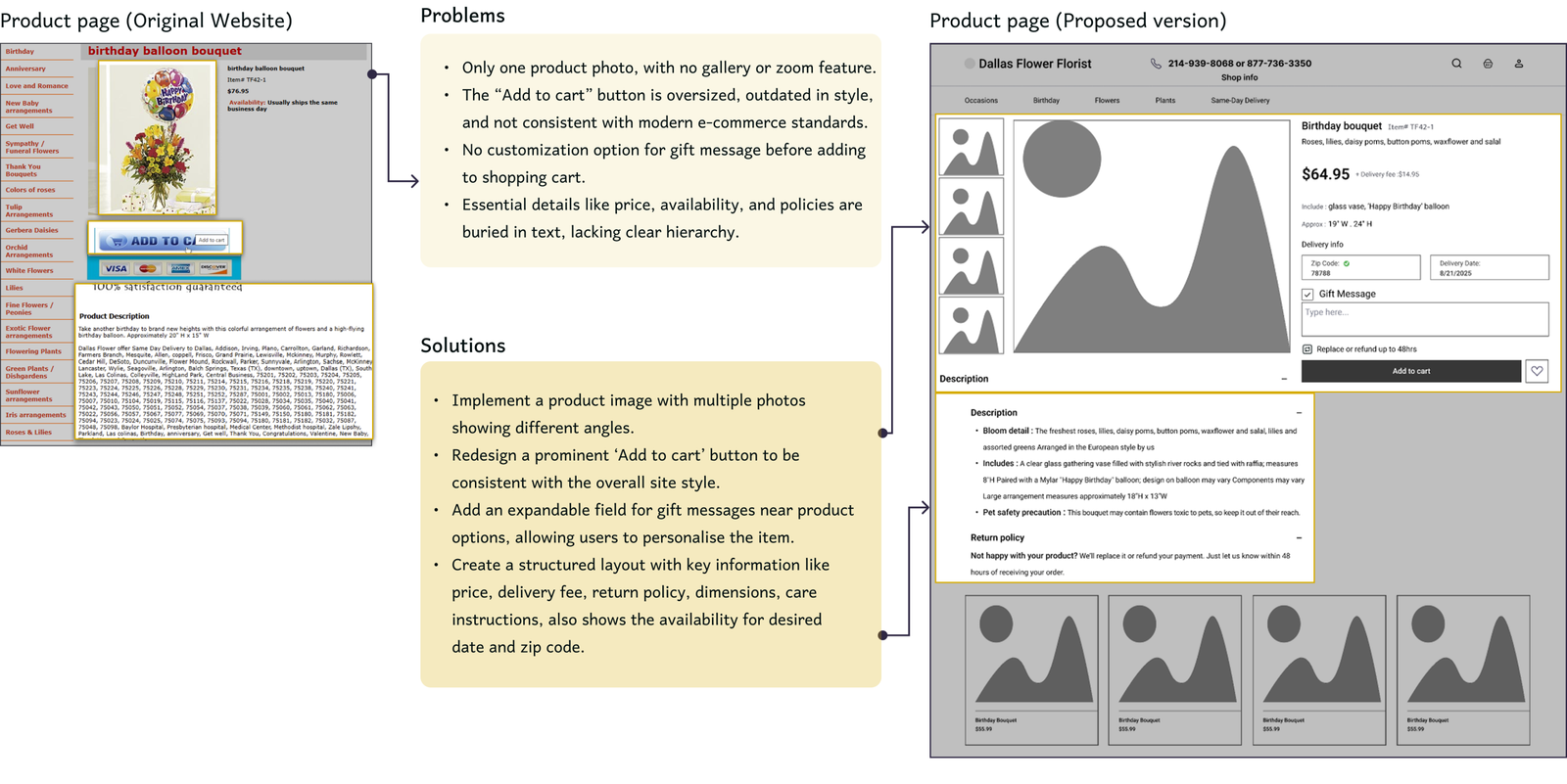
Product page
Shipping cart page
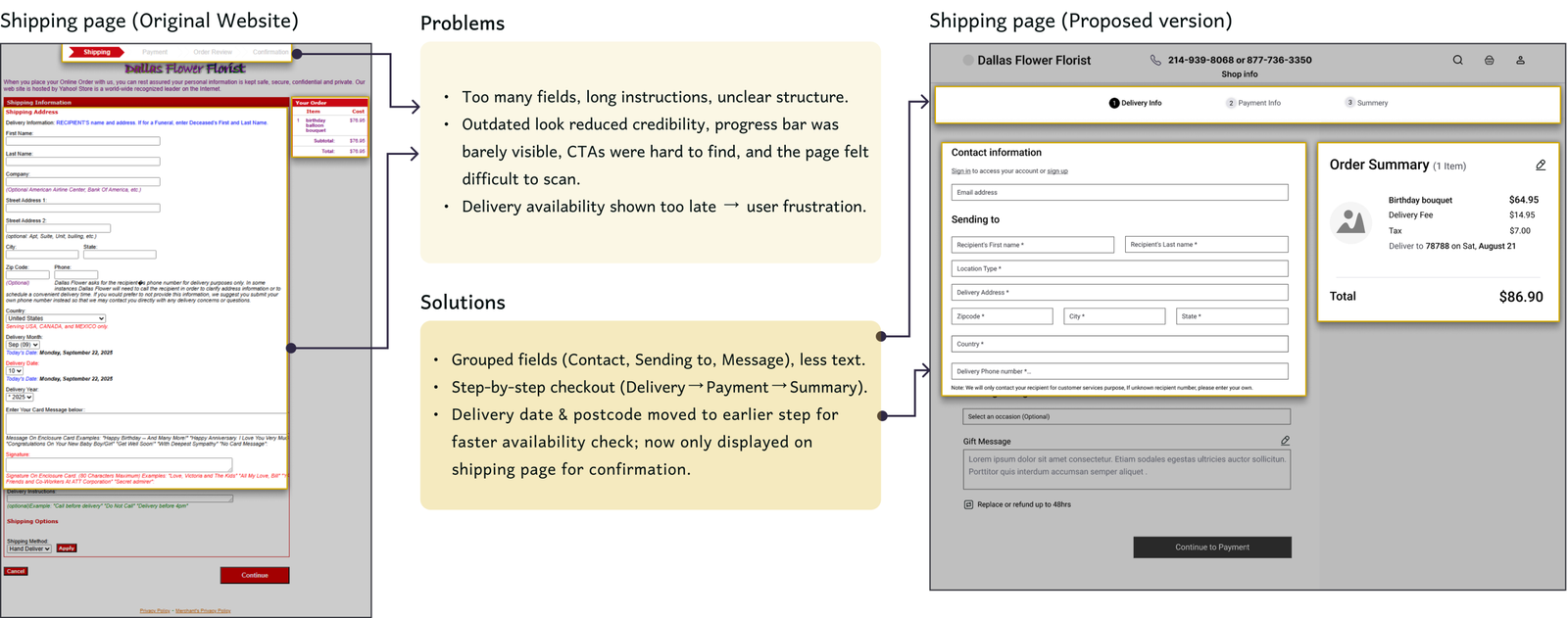
Delivery info page
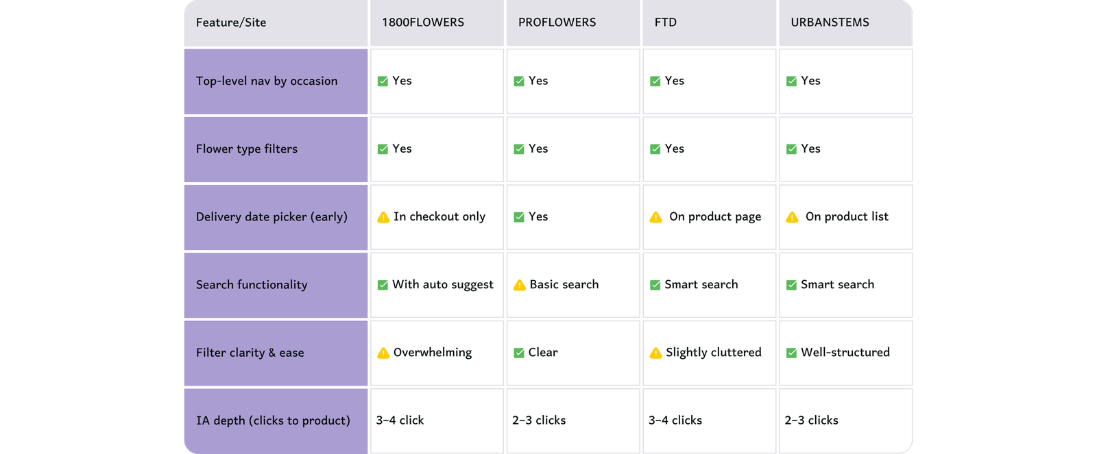
Competitive Analysis
We analysed four competitors, focusing on target market, features, weaknesses, and its information architecture.
Key takeaways:
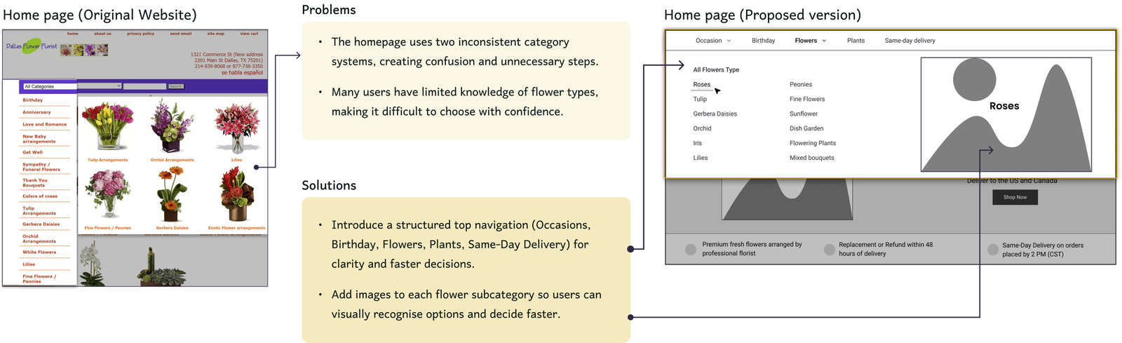
Simplify the site’s navigation by aligning it with core user intents, such as occasion and delivery time.
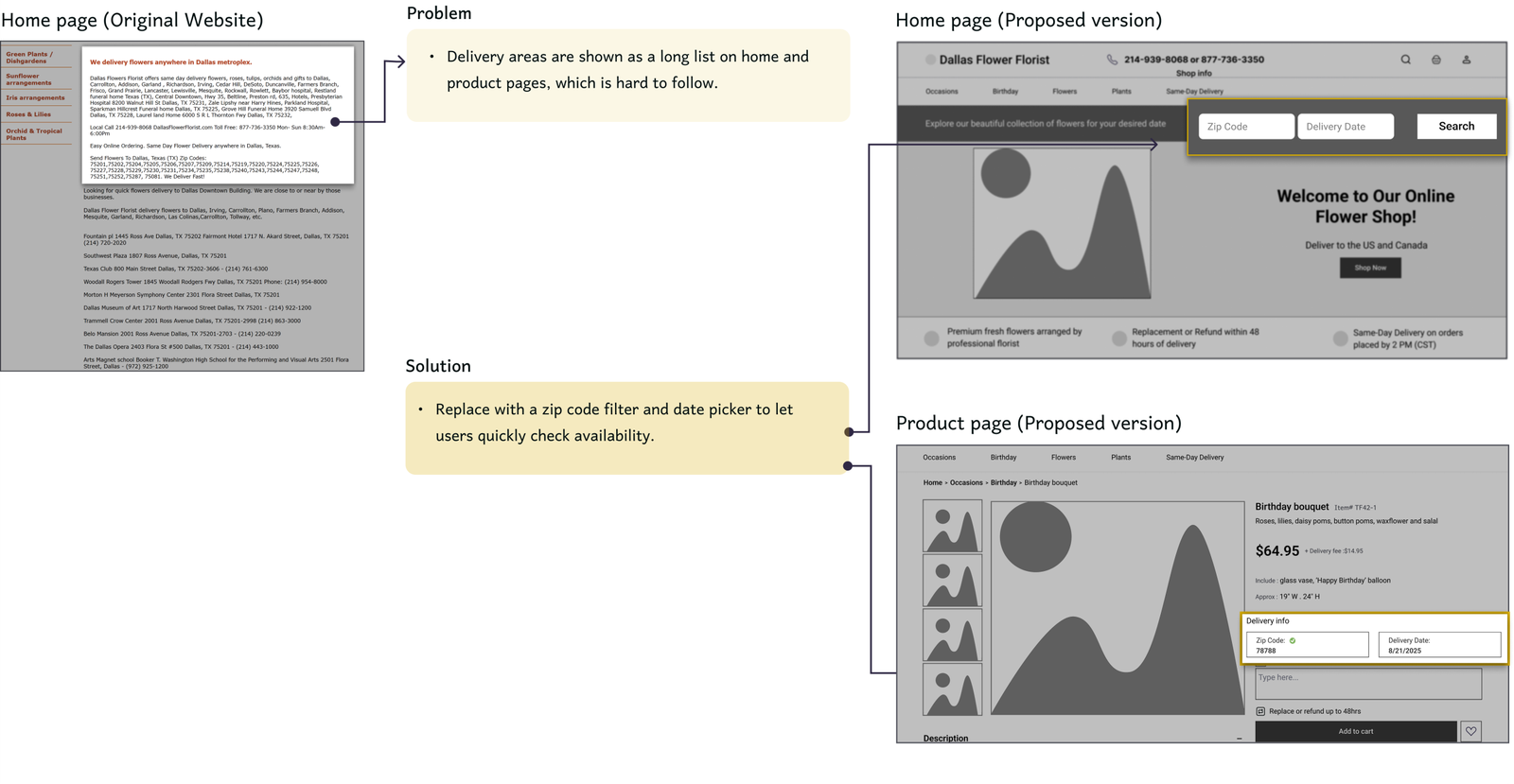
Bring delivery availability forward in the user journey.
Design clear category and landing pages that support easy scanning and intuitive filtering.
Flatten the information architecture by reducing unnecessary layers between the homepage and product pages.
Use emotional cues in the visual hierarchy to support gifting and create a sense of urgency.
User Interview
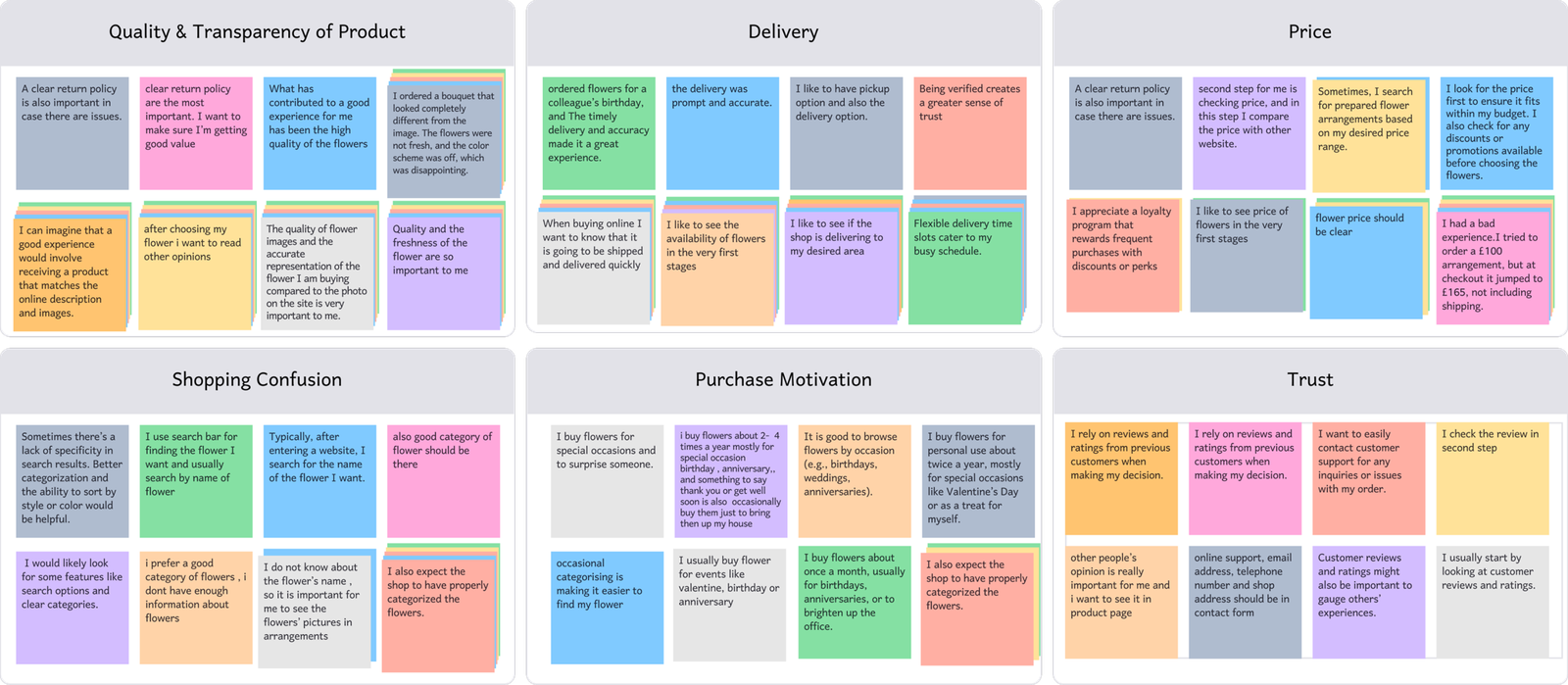
We interviewed 12 users with experience buying flowers online. The insights were organised into an affinity diagram to identify key needs and pain points. By asking a mix of open and closed questions, we were able to shape a clear persona and design with purpose.
Affinity diagram
Key takeaways:
Customers prioritise fresh, high-quality flowers and clear product info that matches delivery.
Customers want clear delivery availability by date and location.
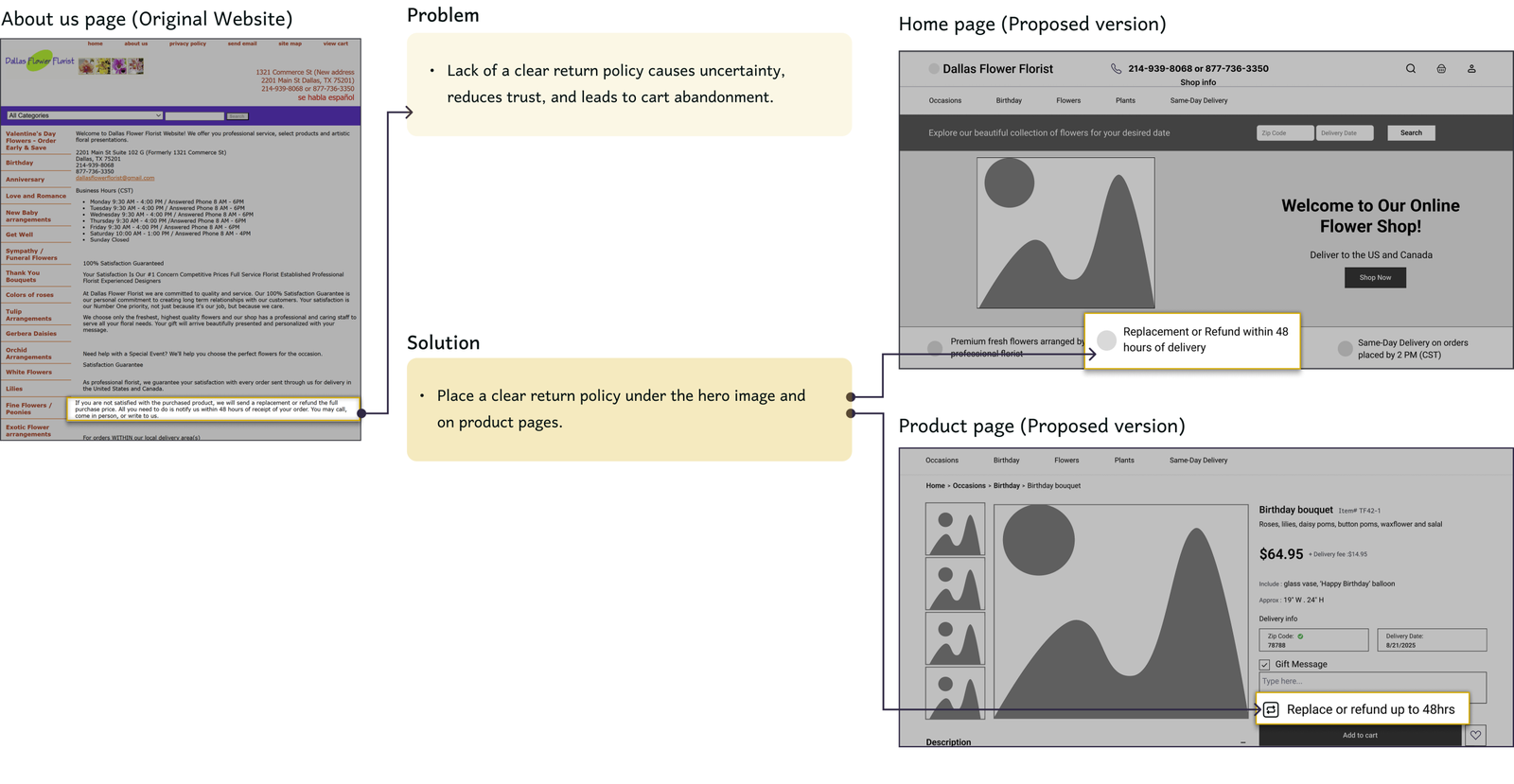
A clear return policy ensures good value and ease of mind for buyers.
Buying flowers is often an emotion-driven purchase tied to specific occasions.
Clear payment processing is valued, including delivery fees and taxes.
Limited flower knowledge makes it hard for customers to buy with confidence.
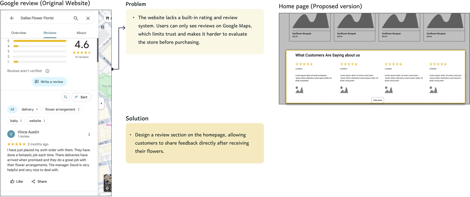
Checking reviews is a common practice before making a purchase decision.
DEFINE
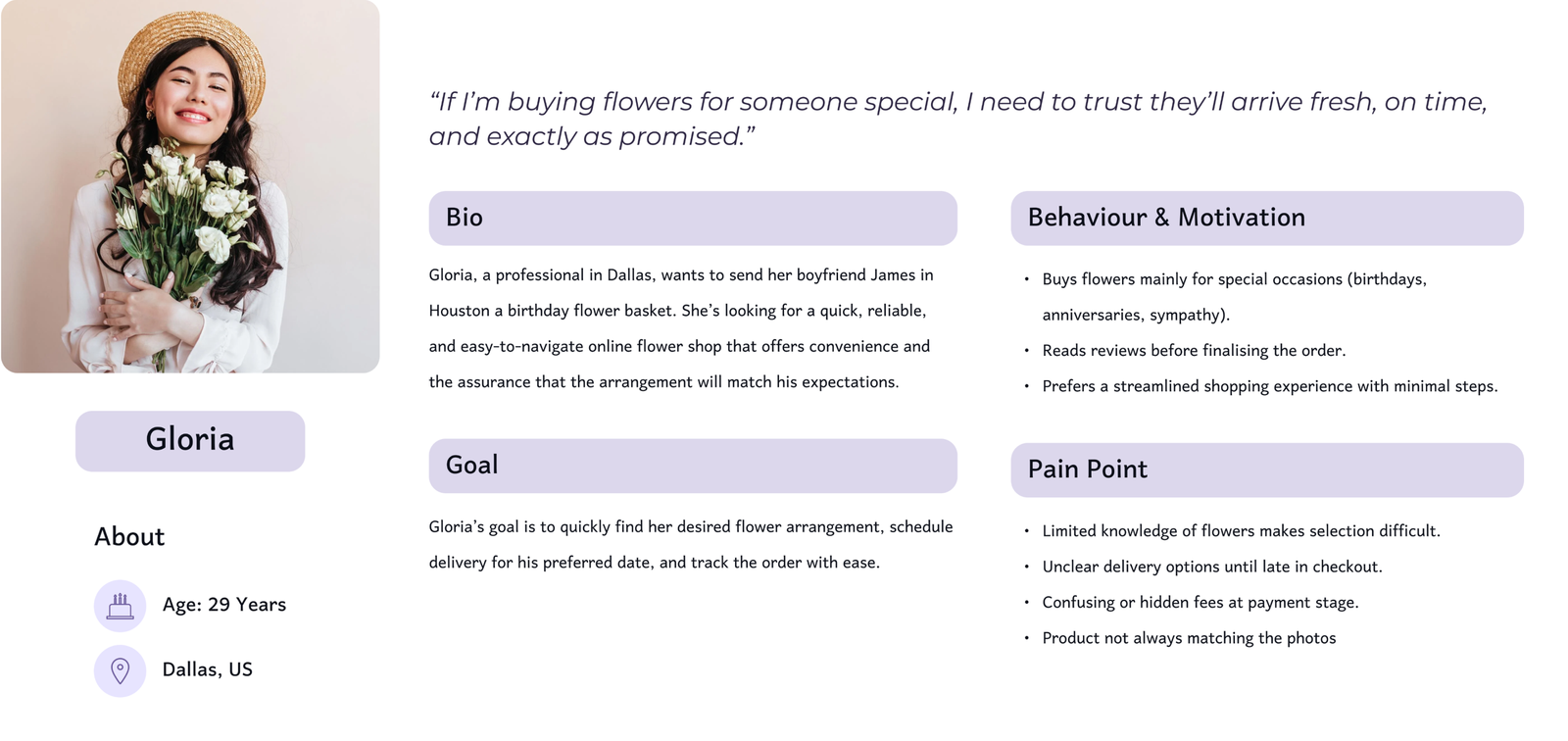
Persona
The insights I gained from interviews leading up to the persona. The main goal is to display those patterns and pain points, which allowed me to further empathise with users.
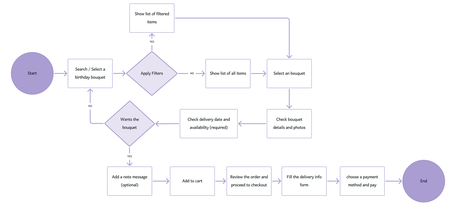
Task Flow and User Flow
Task and user flow illustrate the steps users follow to buy a Pram on our platform. It demonstrates their journey from opening the website to contacting the seller, highlighting key decision points and actions.
Task flow
User flow
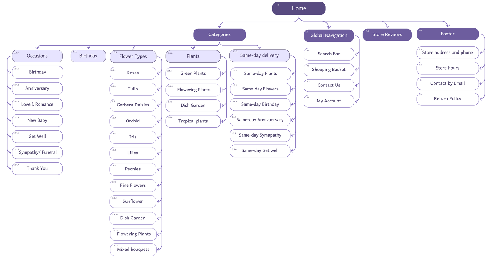
Site Map
We created a site map based on Competitive analysis to ensure the website is intuitive and easy to navigate, aligning with users’ expectations for finding features.
DESIGN
Ideation and Wireframing
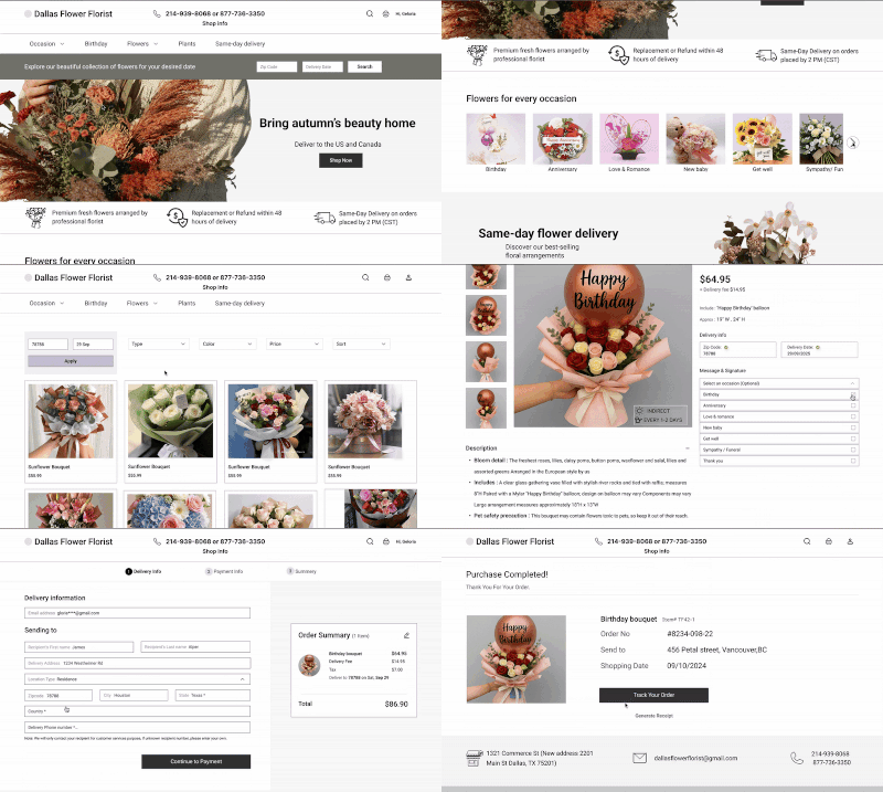
After analysing our research, we identified key challenges and began exploring solutions through design. We started with quick hand-drawn sketches to generate ideas, then developed low-fidelity wireframes to refine the structure, test user flows, and visualise how our solutions addressed those challenges.
Usability & Iteration
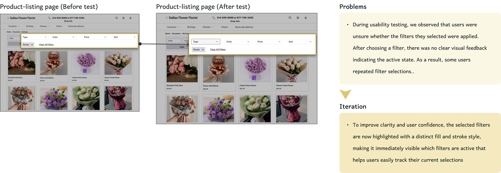
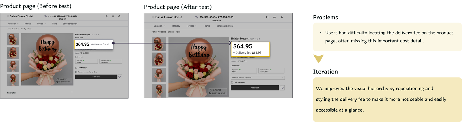
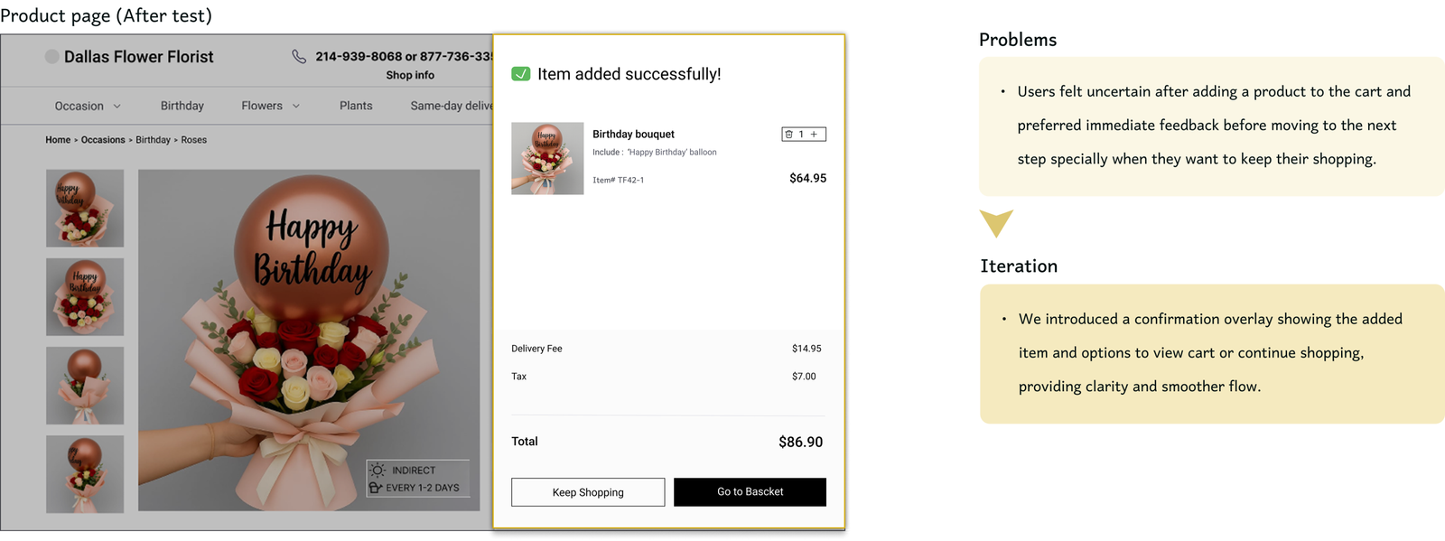
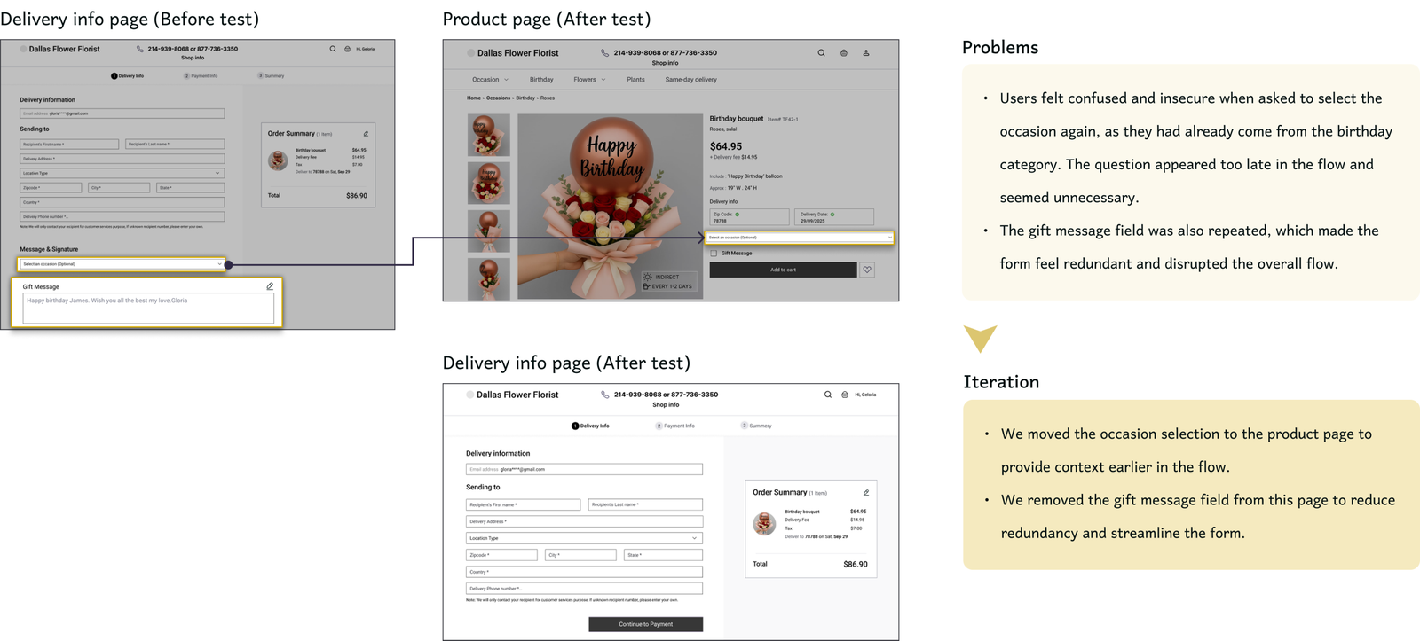
After moving from low- to mid-fidelity wireframes with added visuals and interactions, we ran a moderated usability test in Maze to assess clarity and task flow. We asked users to order a bouquet of roses for a friend’s birthday, including a specific delivery date and zip code; a realistic scenario that tested categories, filters, viewing product details and checkout.4 participants completed the task, helping us identify navigation issues and points of confusion.Insights from the test guided our next design iterations to improve clarity, efficiency, and user confidence.