
Kiddo 1

Website for buying and selling preloved items for children

Kiddo 1

Website for buying and selling 

preloved items for children

About Kiddo

A sustainable platform in the UK serving as a marketplace for buying and selling children’s items. Parents can purchase kids’ products including bedding, feeding accessories, toys, clothing, and more; at affordable prices or sell items they no longer need.

About Kiddo

A sustainable platform in the UK serving as a marketplace for buying and selling children’s items. Parents can purchase kids’ products including bedding, feeding accessories, toys, clothing, and more; at affordable prices or sell items they no longer need.

PROJECT OVERVIEW

As a student at UX land, I was assigned to design a website for a desktop and mobile application with this detail:

Stakeholder needs:

Developing a user-friendly peer-to-peer platform that simplifies listing items for sale and makes it easy to find and buy pre-owned children’s items, promoting reuse and reducing waste.
This section focuses on the buyer’s journey in the case study.


Potential Users:

Parents & Guardians (Primary Users)

Expecting & New Parents

Families & Relatives with Growing Kids
Challenge:

  • Busy parents had limited time for interviews, making user data collection difficult.
  • Lack of established platforms for peer-to-peer trading of children’s items.

THE PROCESS

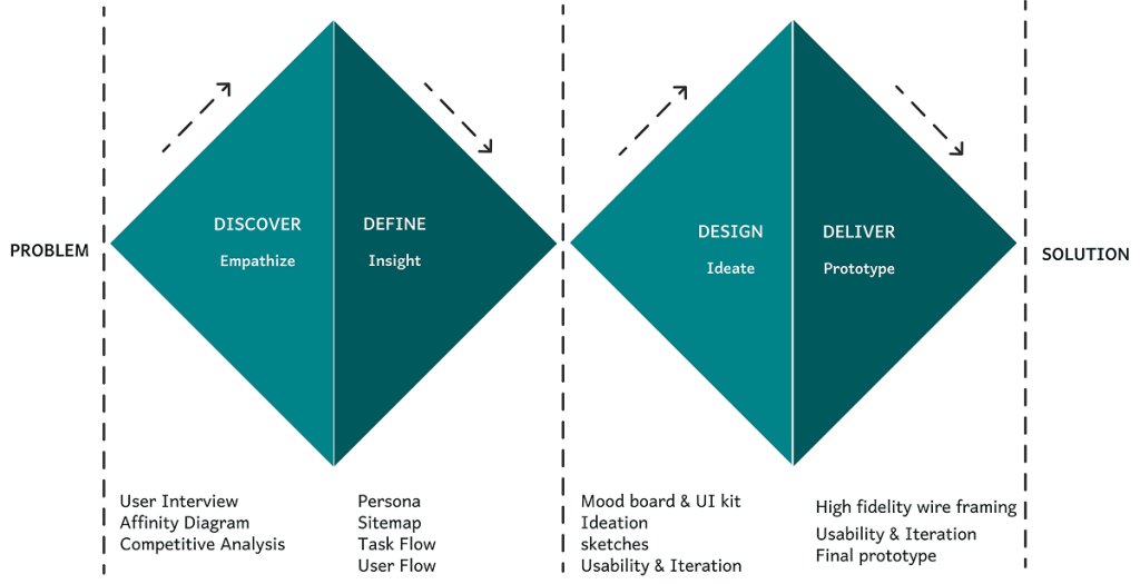
Our team of five ran a Double Diamond Design based on the Design Thinking Methodology. It was not a linear path, we bounced between stages as the project progressed.

DISCOVER

User Interview

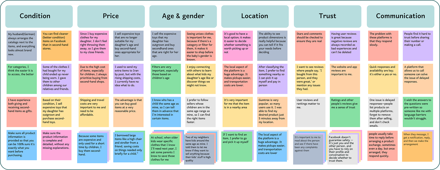
We interviewed 15 parents with one or two children, all experienced in using secondhand platforms for kids’ items. The insights gathered were organised into an affinity diagram to identify key needs and pain points.We asked more open-ended questions, allowing for a discussion with the interviewees rather than a straightforward question-and-answer format.

Affinity diagram

Takeaways

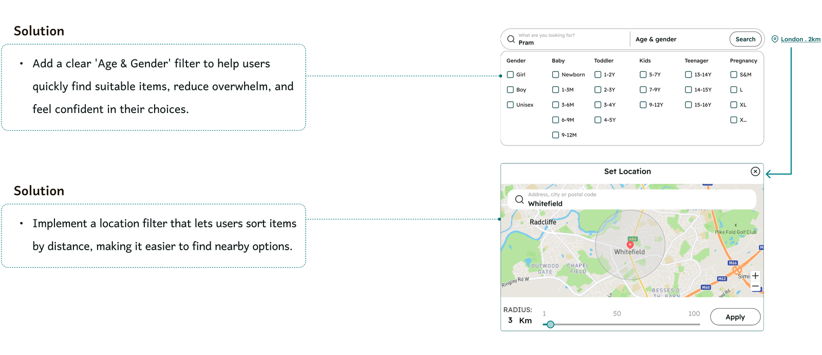
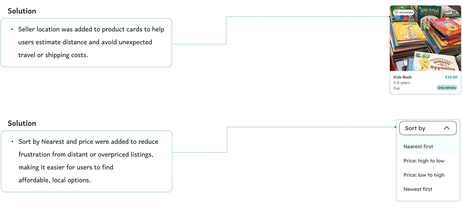
  • Users prefer to buy from nearby sellers so they can check the item in person and make sure it’s in good condition, avoiding unnecessary shipping costs.
  • Users want to communicate with the seller and get quick, responsive answers to their questions.
  • In second-hand purchases, uncertainty around the seller creates hesitation and makes it hard for people to feel assured in their decision.
  • Users consistently mentioned age and gender, and price as key factors when browsing second-hand items.

Competitive Analysis

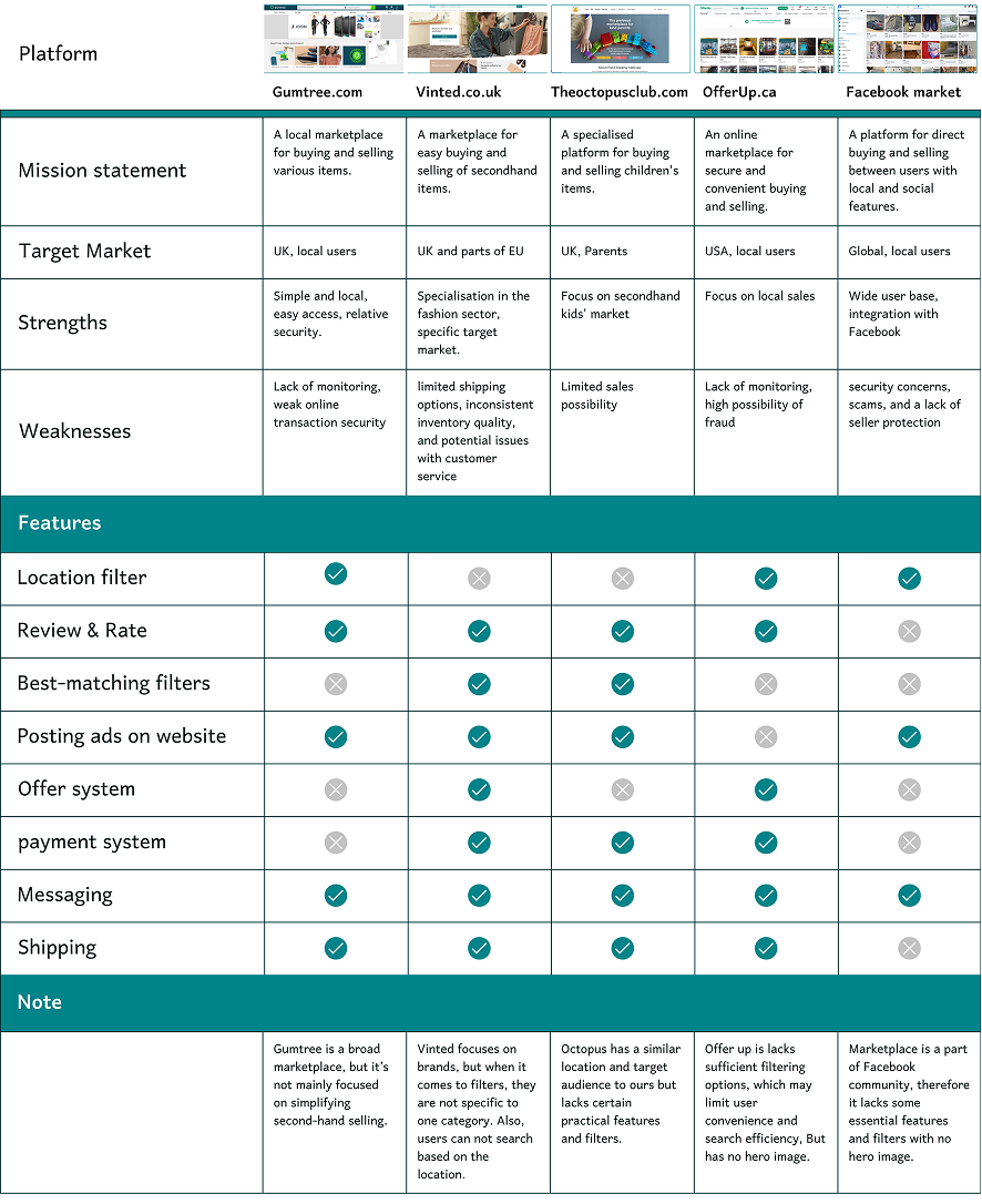
We analysed five similar platforms, focusing on target market, features, weaknesses, and their information architecture.

Key Takeaways

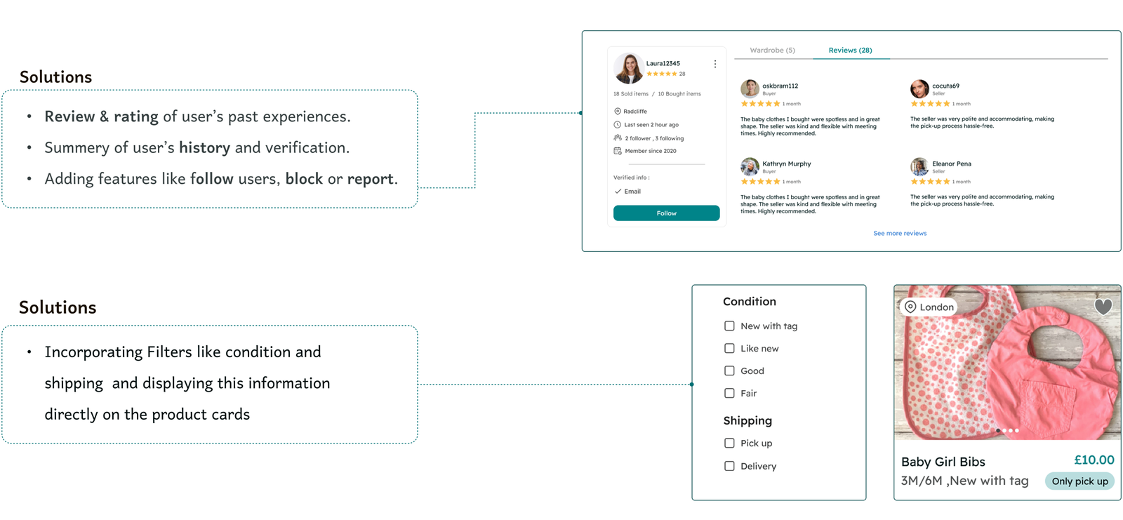
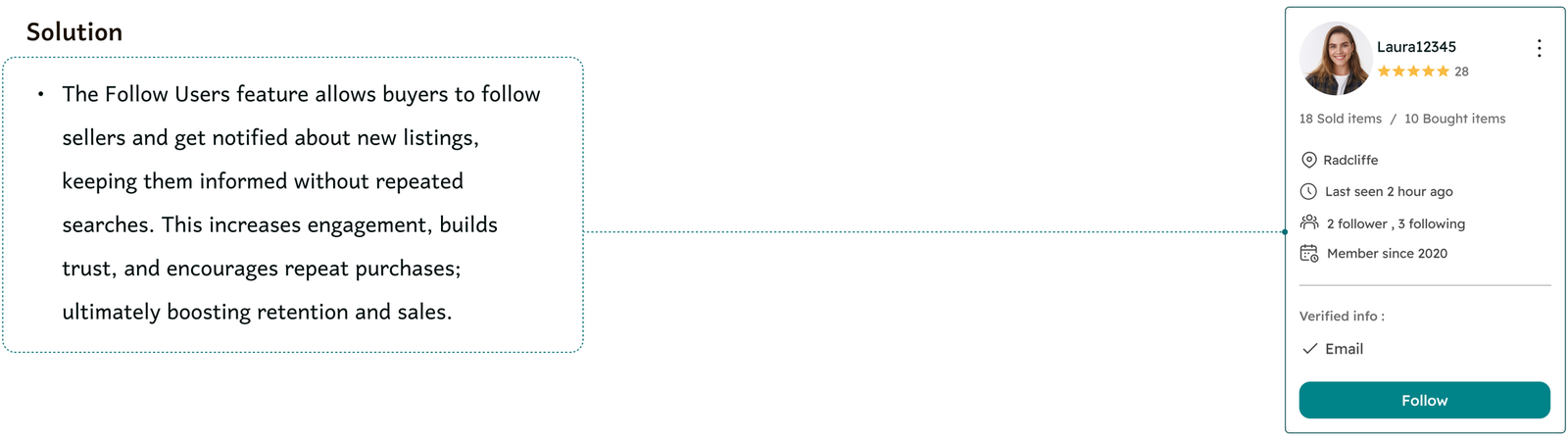
  • Use reviews, ratings, profile summaries, and the option to follow sellers to help build trust.
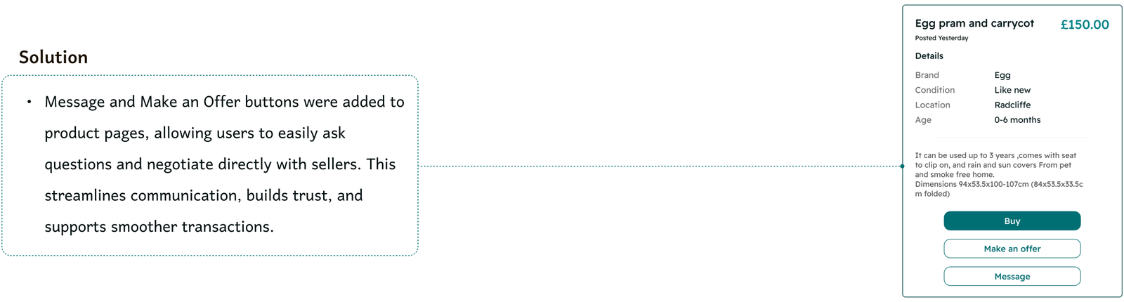
  • Use an offer system and direct messaging to enhance interaction between buyers and sellers.
  • Analysed how competitors structure filter hierarchy.

DEFINE

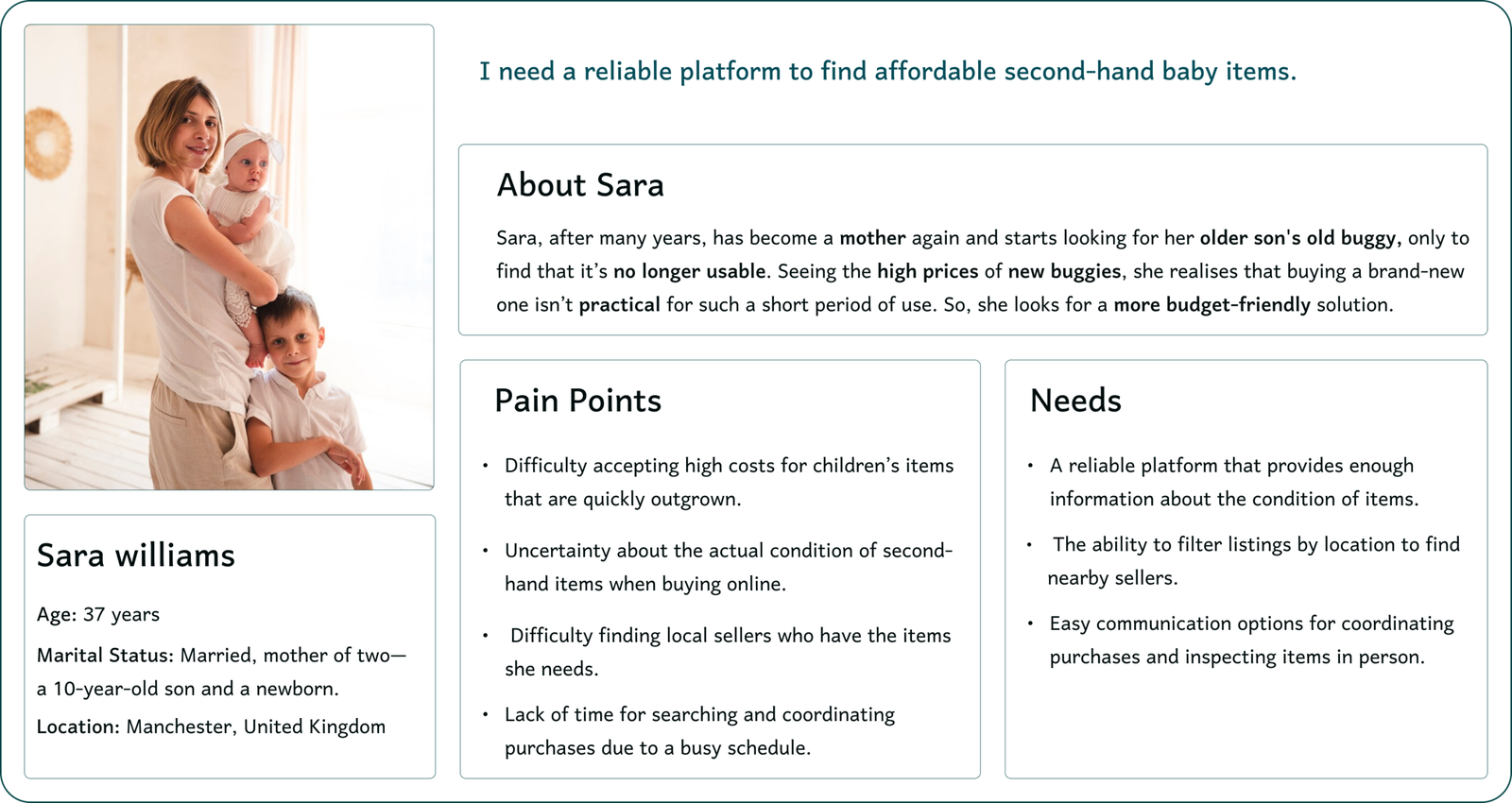
Persona

The insights we gained from interviews leading up to the persona. The main goal is to display those patterns and pain points, which allowed us to further empathise with users.

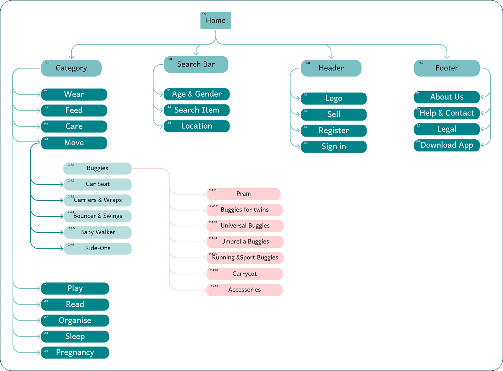
Site Map

We created a site map based on Competitive analysis to ensure the website is intuitive and easy to navigate, aligning with users’ expectations for finding features.

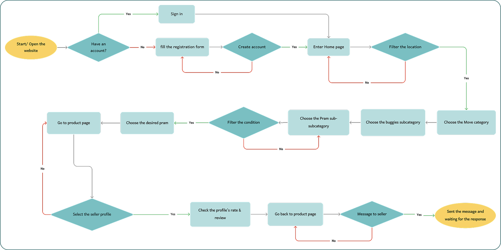
Task Flow and User Flow

Task and user flow illustrate the steps users follow to buy a Pram on our platform. It demonstrates their journey from opening the website to contacting the seller, highlighting key decision points and actions.

Task flow

User flow

DESIGN

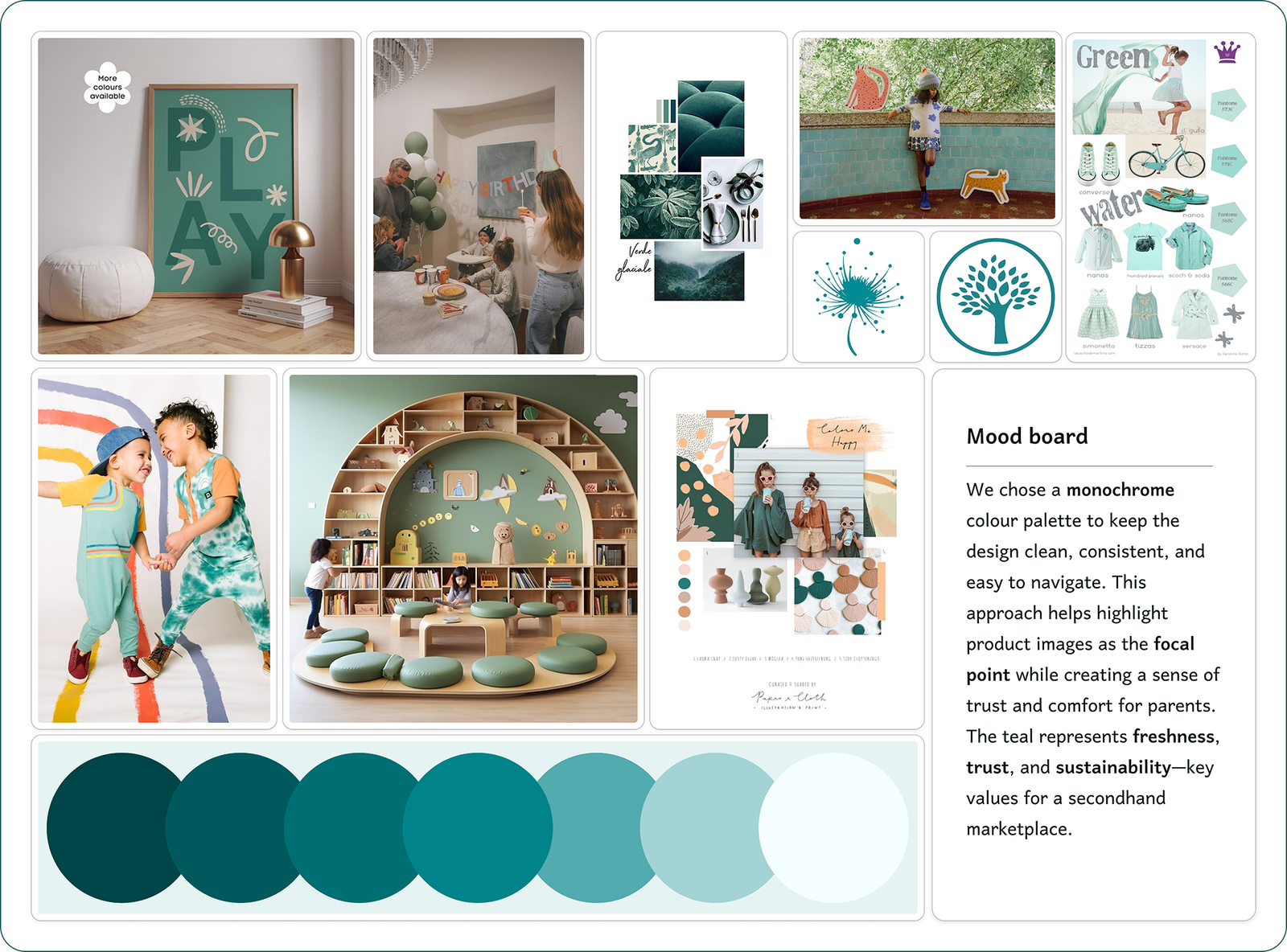
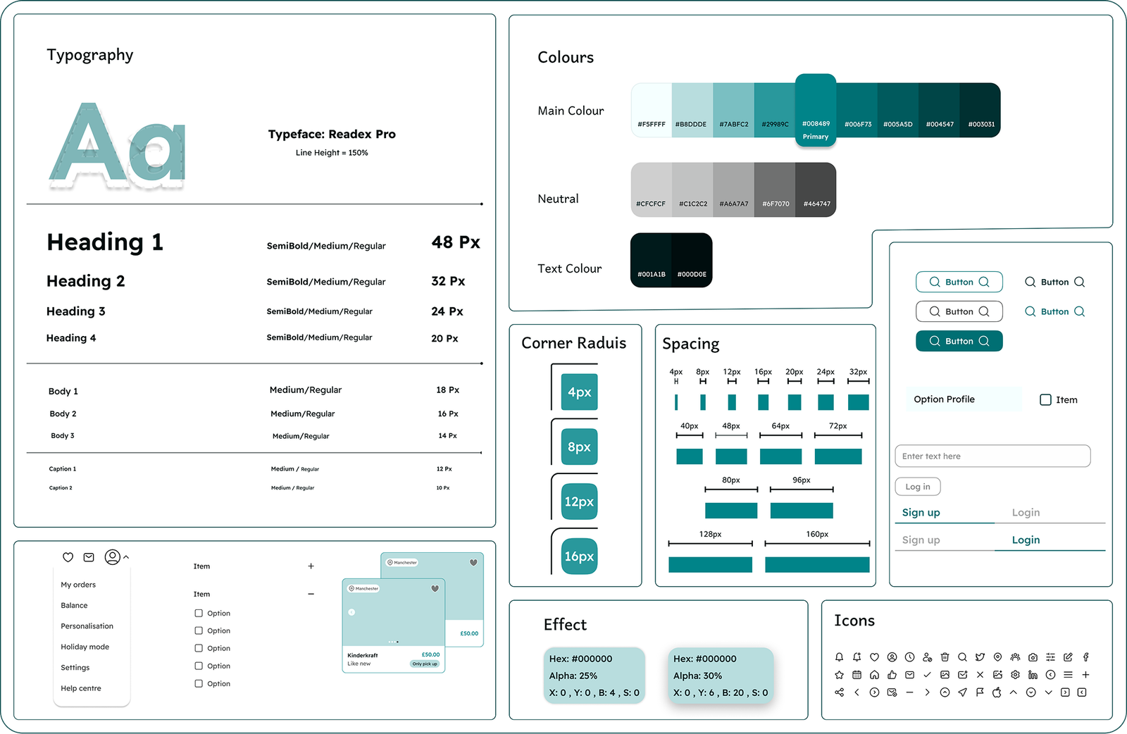
Mood board & UI kit

For designing high-fidelity interfaces, we defined a design system consisting of colours, fonts, and dimensions of elements on all screens.

Challenges & Solutions

After analysing our research, we identified key challenges and began exploring solutions through design. We started with quick hand-drawn sketches to brainstorm ideas, then created mid-fidelity wireframes to define structure and user flows. After testing and iterating based on feedback, we developed high-fidelity designs, some of which are showcased below as final solutions.

Challenge 1

Users feel uncertain when sellers are unresponsive or lack clear information, leading to concerns about item condition and purchase reliability.

Challenge 2

Users face the challenge of finding second-hand items that match their child’s age, gender, condition, and budget. Additionally, many items are located far away, making postage or travel costs too high.

Challenge 3

Users struggle to keep track of sellers they like, forcing them to repeatedly search for the same profiles when looking for new items.

Challenge 4

Users can’t easily chat or negotiate with the seller, which leads to hesitation or dropping the purchase.

Usability & Iteration (Phase 1)

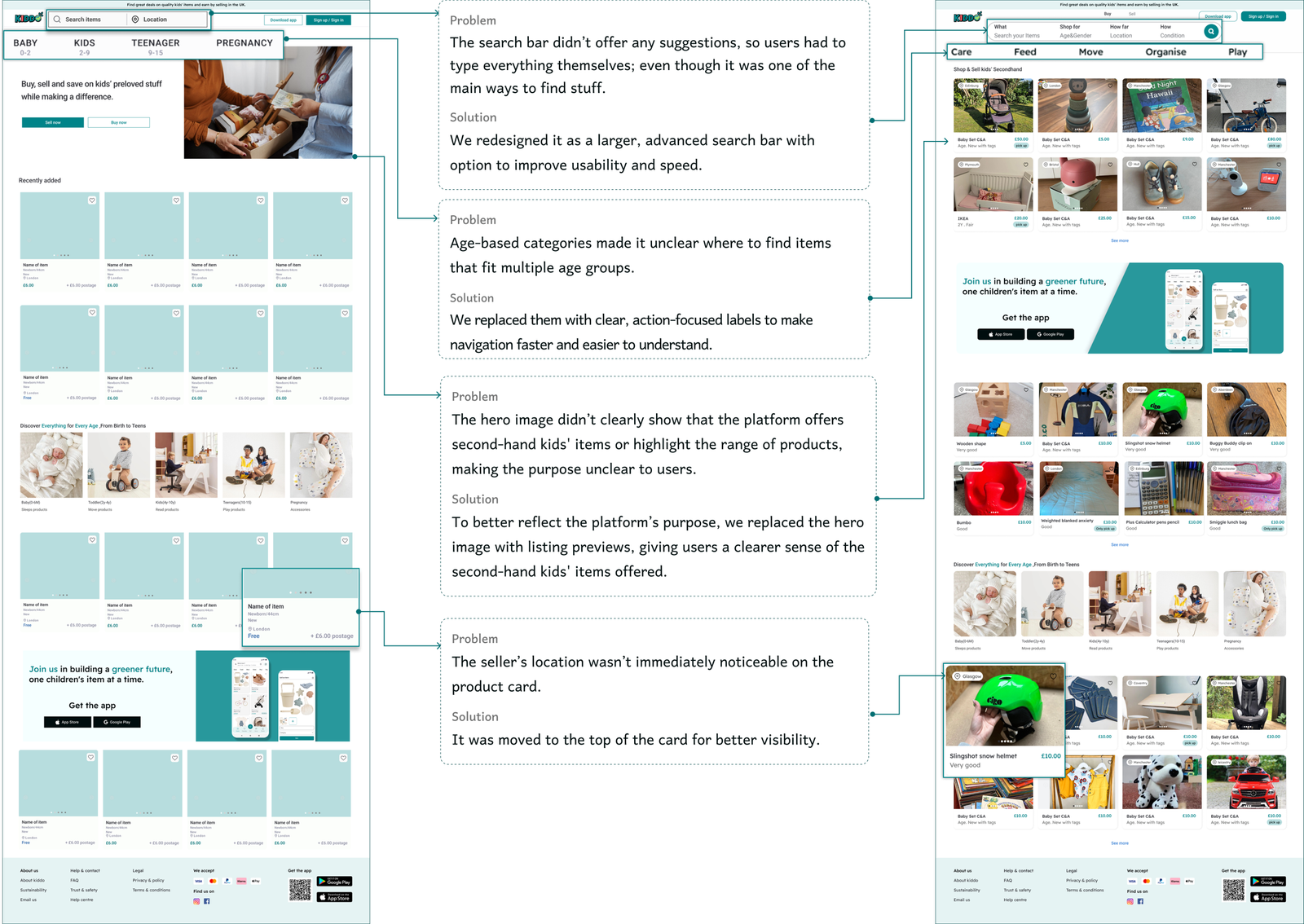
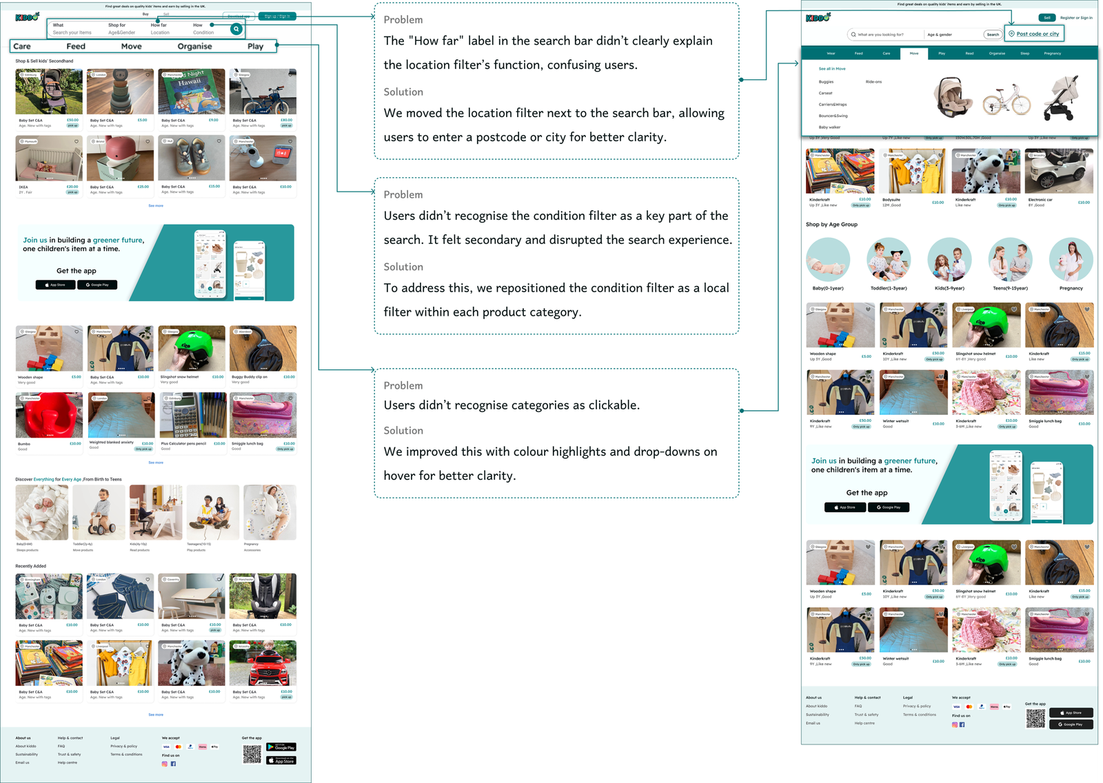
We created mid-fidelity wireframes and tested to refine our design.Here is the iterative design process for ‘Home Page’.

Usability & Iteration (Phase 2)

We created high-fidelity wireframes and tested them with 7 users — 5 unmoderated via Maze and 2 moderated. All participants completed the task of buying a pram, helping us validate the core design. However, despite the task’s success, user feedback revealed a few minor design improvements needed to enhance clarity and usability.

DELIVER

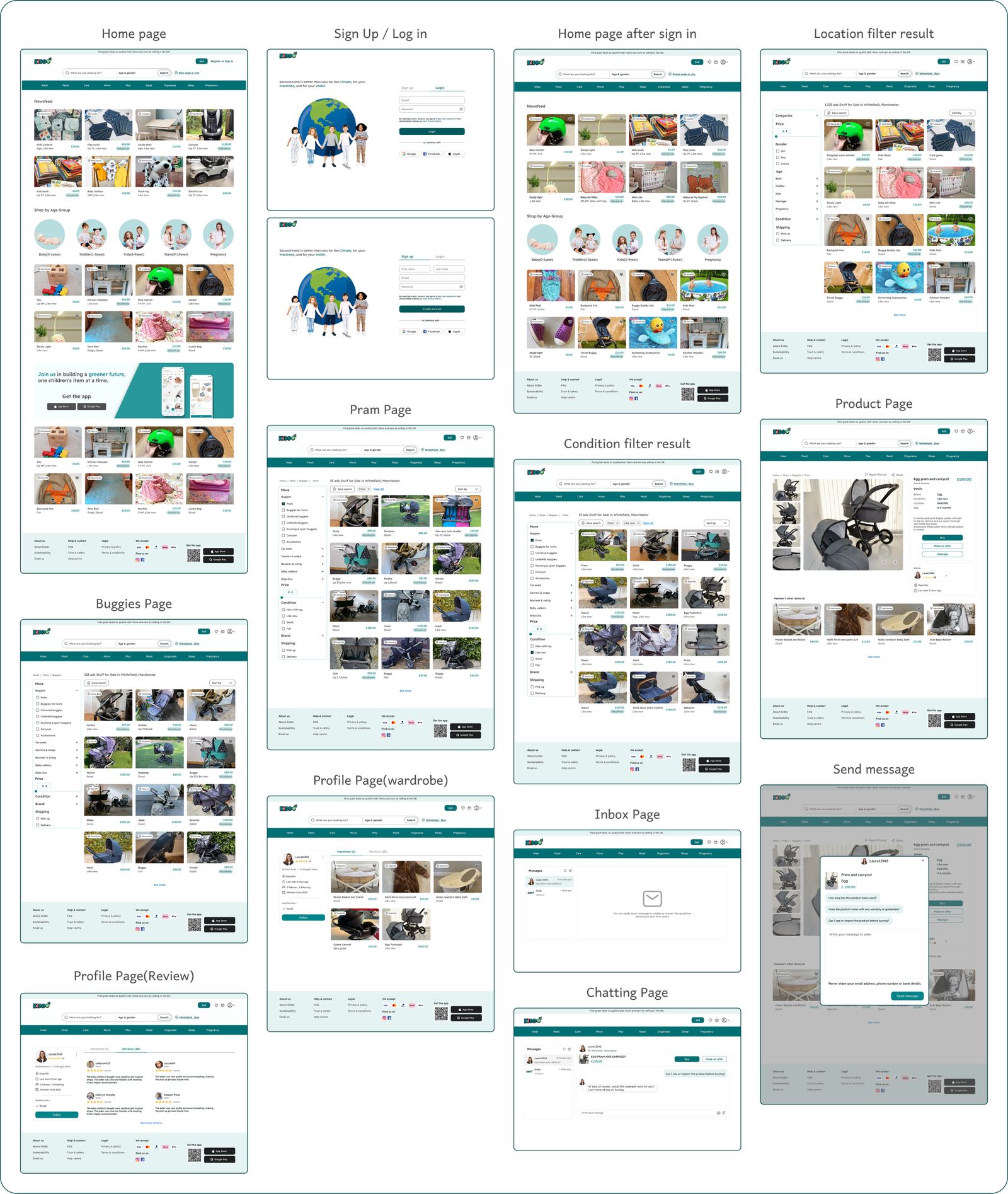
High fidelity wireframes

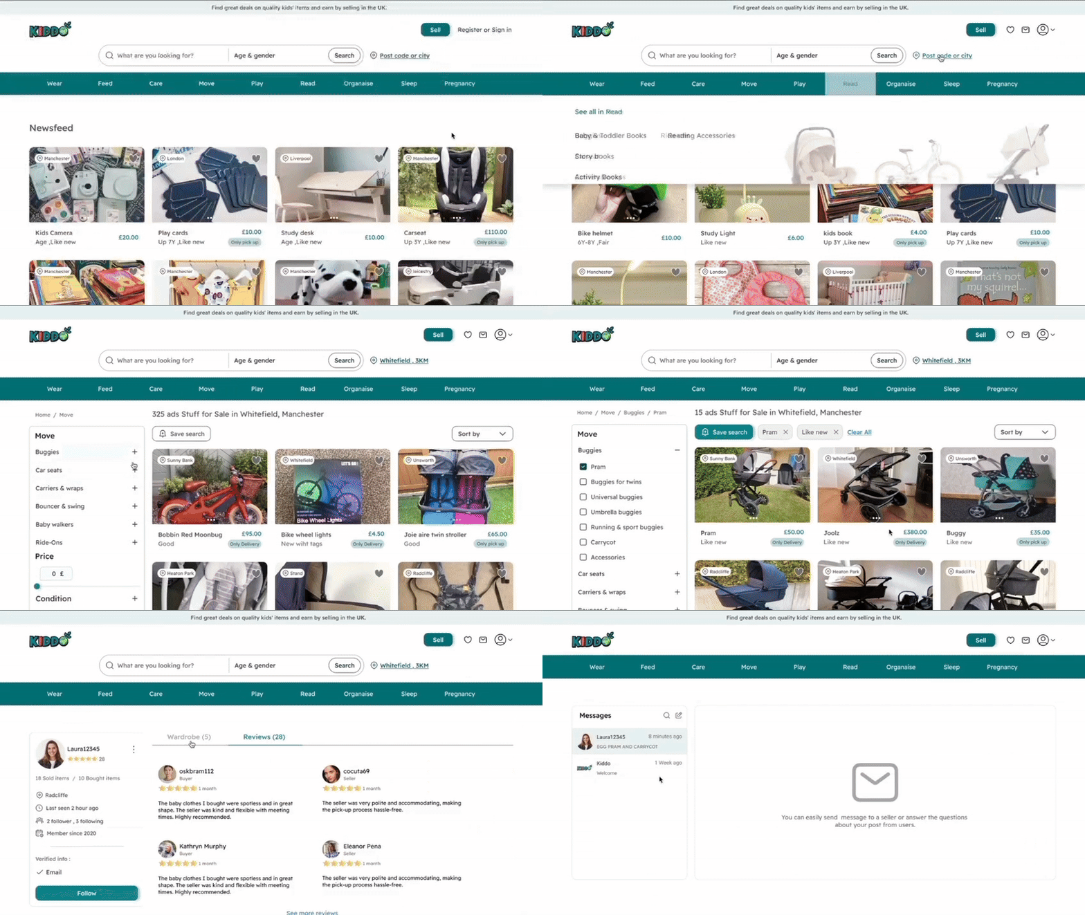
Final Prototype

In this section, you can check out the complete final prototype.

Final Prototype

In this section, you can check out the complete final prototype.